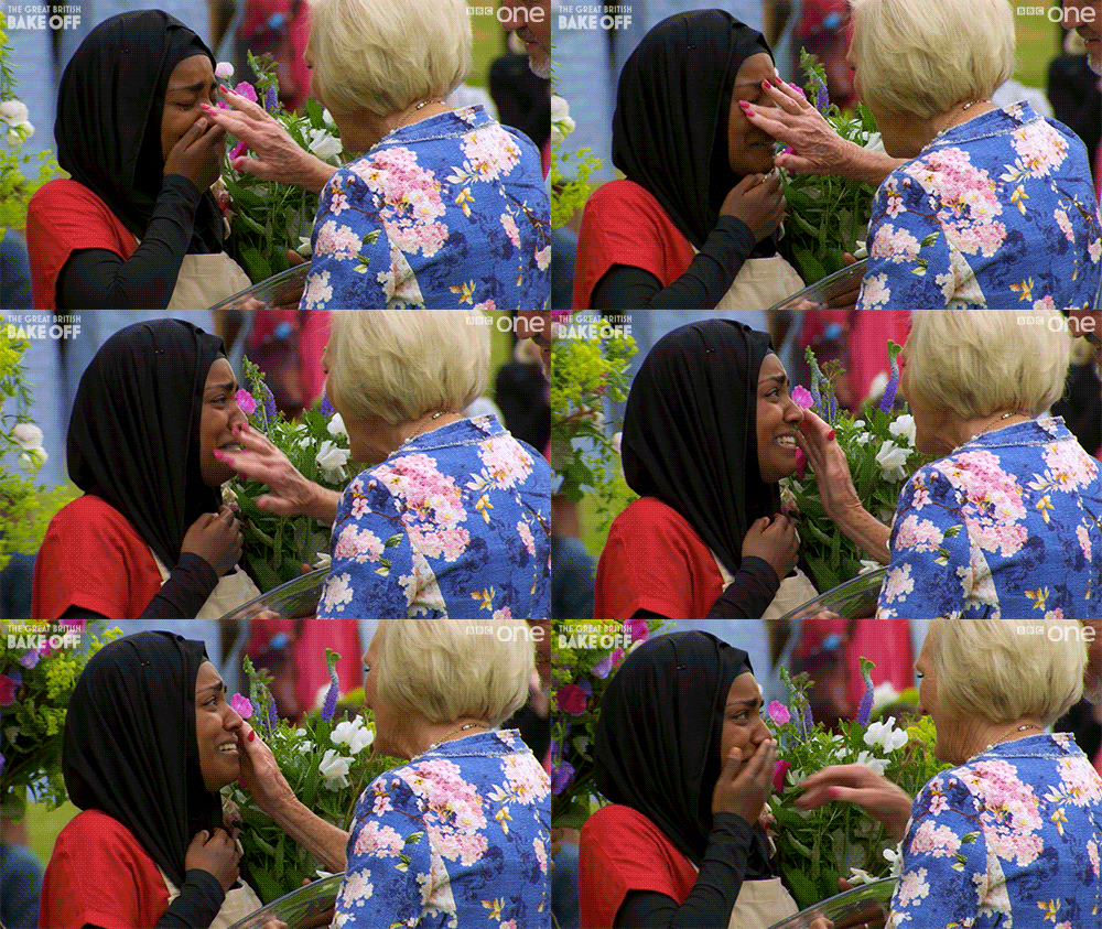
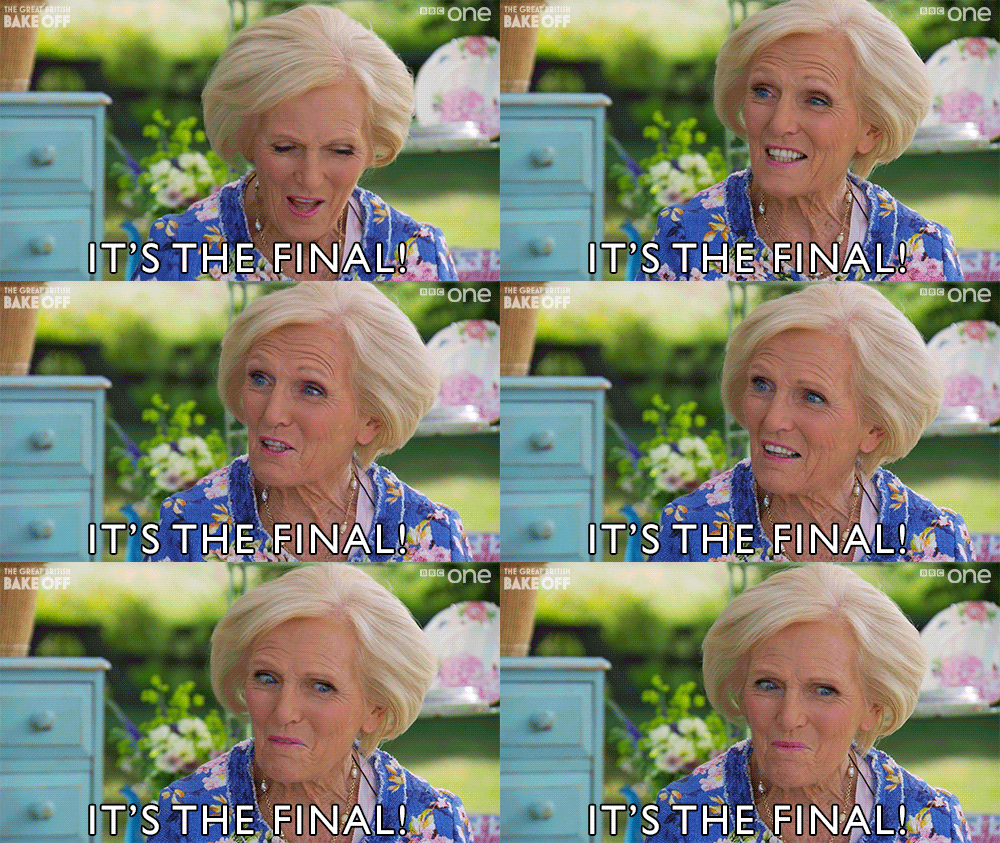
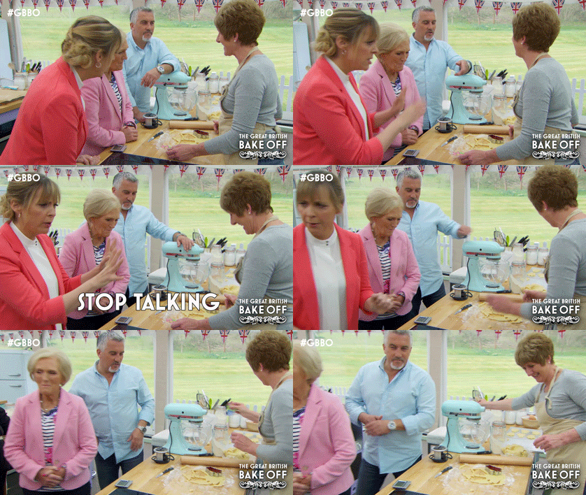
class: center, middle, inverse, title-slide # Lab 11 (?): CS631 ## One Dataset, Visualized 11 Ways ### Alison Hill, Steven Bedrick, Jackie Wirz --- class: center, middle, inverse # Inspired by: ## Flowing Data: https://flowingdata.com/2017/01/24/one-dataset-visualized-25-ways/ --- # Packages first I'll use all of the following: ```r library(tidyverse) library(viridis) # colors! library(beyonce) # colors!! library(extrafont) # fonts! ``` --- # Data second Find it [here](http://bit.ly/cs631-ratings): http://bit.ly/cs631-ratings ```r ratings <- read_csv(here::here("static/labs/data", "episodes.csv"), na = c("", "NA", "N/A"), col_types = cols( viewers_7day = col_number(), series = col_factor(levels = NULL) )) ``` --- # Glimpse ``` Observations: 74 Variables: 12 $ series <fct> 1, 1, 1, 1, 1, 1, 2, 2, 2, 2, 2, 2, 2, 2,… $ episode <dbl> 1, 2, 3, 4, 5, 6, 1, 2, 3, 4, 5, 6, 7, 8,… $ airdate <chr> "17 August 2010 (2010-08-17)", "24 August… $ uk_airdate <chr> "17 August 2010", "24 August 2010", "31 A… $ uk_premiere <date> 2010-08-17, 2010-08-24, 2010-08-31, 2010… $ viewers_7day <dbl> 2.24, 3.00, 3.00, 2.60, 3.03, 2.75, 3.10,… $ weekly_ranking_network <dbl> 7, 3, 2, 4, 1, 1, 2, 2, 1, 1, 1, 1, 1, 1,… $ weekly_ranking_all_channels <dbl> NA, NA, NA, NA, NA, NA, NA, NA, NA, NA, N… $ viewers_28day <dbl> NA, NA, NA, NA, NA, NA, NA, NA, NA, NA, N… $ bbc_iplayer_requests <dbl> NA, NA, NA, NA, NA, NA, NA, NA, NA, NA, N… $ us_season <dbl> NA, NA, NA, NA, NA, NA, NA, NA, NA, NA, N… $ us_airdate <chr> NA, NA, NA, NA, NA, NA, NA, NA, NA, NA, N… ``` --- class: center, middle, inverse # 🎂 ## Recipe 1: Continuous Bar Chart --- ## Recipe 1: Continuous Bar Chart <img src="11-slides_files/figure-html/unnamed-chunk-4-1.png" width="70%" style="display: block; margin: auto;" /> --- ## Recipe 1: Code for Bar Chart ```r # some small wrangling ratings_bonanza1 <- ratings %>% mutate(ep_id = row_number(), series = as.factor(series)) %>% select(ep_id, viewers_7day, series, episode) mybey <- beyonce_palette(66)[c(11,10,7,6,5,4,3,1)] # make the plot ggplot(ratings_bonanza1, aes(x = ep_id, y = viewers_7day, fill = series)) + geom_col(alpha = .9) + theme_minimal() + ggtitle("Series 8 was a Big Setback in Viewers", subtitle= "7-Day Viewers across All Series/Episodes") + theme(legend.position = "bottom", text = element_text(family = "Lato"), axis.text.x = element_blank(), axis.ticks.x = element_blank(), axis.title.x = element_blank()) + scale_fill_manual(values = mybey) + scale_x_continuous(expand = c(0, 0)) + guides(fill = guide_legend(nrow = 1)) ``` --- class: center, middle, inverse # 🎂 ## Recipe 1.2: Ribbons not Bars --- ## Recipe 1.2: Ribbons not Bars <img src="11-slides_files/figure-html/unnamed-chunk-6-1.png" width="70%" style="display: block; margin: auto;" /> --- ## Recipe 1.2: Code for Ribbons ```r ggplot(ratings_bonanza1, aes(x = ep_id, y = viewers_7day, fill = series, color = series)) + geom_ribbon(aes(ymin = 0, ymax = viewers_7day), alpha = .75) + geom_line() + geom_text(data = filter(ratings_bonanza1, series %in% c(1:2) & episode == 4), aes(y = 1.5, label = series), size = 3, color="white", family = "Lato") + geom_text(data = filter(ratings_bonanza1, series %in% c(3:8) & episode == 6), aes(y = 1.5, label = series), size = 3, color="white", family = "Lato") + theme_minimal() + ggtitle("Series 8 was a Big Setback in Viewers", subtitle= "7-Day Viewers across All Series/Episodes") + theme(legend.position = "bottom", text = element_text(family = "Lato"), axis.text.x = element_blank(), axis.ticks.x = element_blank(), axis.title.x = element_blank()) + scale_fill_manual(values = mybey) + scale_color_manual(values = mybey) + scale_x_continuous(expand = c(0, 0)) + guides(fill = FALSE, color = FALSE) ``` --- class: center, middle, inverse # 🎂 ## What is going on with Series 8? > *"The eighth series of The Great British Bake Off began on 29 August 2017, with this being the first of The Great British Bake Off to be broadcast on Channel 4, after the production company Love Productions moved the show. It is the first series for new hosts Noel Fielding and Sandi Toksvig, and new judge Prue Leith." -- <a href="https://en.wikipedia.org/wiki/The_Great_British_Bake_Off_(series_8)">Wikipedia</a>* --- class: center, middle, inverse  ## Read: -- ## No Mary Berry, no Mel, no Sue --- class: center, middle, inverse # 🎂 ## Recipe 2: Lollipop Plot --- ## Recipe 2: Lollipop Plot <img src="11-slides_files/figure-html/unnamed-chunk-8-1.png" width="70%" style="display: block; margin: auto;" /> --- ## Recipe 2: Code for Lollipop Plot ```r ratings_bonanza2 <- ratings %>% group_by(series) %>% mutate(series_avg = mean(viewers_7day, na.rm = TRUE), diff_avg = viewers_7day - series_avg)%>% filter(max(episode) == 10) %>% mutate(episode = as.factor(episode)) %>% select(episode, viewers_7day, series, diff_avg, series_avg) ggplot(ratings_bonanza2, aes(x = episode, y = viewers_7day, color = diff_avg)) + geom_hline(aes(yintercept = series_avg), alpha = .5) + geom_point() + geom_segment(aes(xend = episode, yend = series_avg)) + facet_wrap(~series) + scale_color_viridis(option="plasma", begin = 0, end = .8, guide = FALSE) + theme_minimal() + theme(text = element_text(family = "Lato")) + ggtitle("Great British Bake Off Finales Get the Most Viewers", subtitle = "Way Higher than Series Average (for Series with 10 episodes)") ``` --- class: center, middle, inverse # 🎂 ## Recipe 3: Grouped Line Plot by Series --- ## Recipe 3: Grouped Line Plot by Series <img src="11-slides_files/figure-html/unnamed-chunk-10-1.png" width="70%" style="display: block; margin: auto;" /> --- ## Recipe 3: Code for Series Grouped Line Plot ```r mybey <- beyonce_palette(66)[c(11,10,7,6,5,4,3,1)] ggplot(ratings, aes(x = as.factor(episode), y = viewers_7day, color = fct_reorder2(series, episode, viewers_7day), group = series)) + geom_line() + theme_minimal() + scale_color_manual(values = mybey) + labs(color = "Series", x = "Episode") + theme(text = element_text(family = "Lato")) ``` --- class: center, middle, inverse # 🎂 ## Recipe 3.1: Redo Recipe 3 ## Facetted Series Grouped Line Plot --- ## Recipe 3.1: Facetted Line Plot <img src="11-slides_files/figure-html/unnamed-chunk-12-1.png" width="70%" style="display: block; margin: auto;" /> --- ## Recipe 3.1: Code for Facetted Line Plot ```r mybey <- beyonce_palette(66)[c(11,10,7,6,5,4,3,1)] ggplot(ratings, aes(x = as.factor(episode), y = viewers_7day, color = fct_reorder2(series, episode, viewers_7day), group = series)) + geom_line(lwd = 2) + theme_minimal() + scale_color_manual(values = mybey) + labs(color = "Series", x = "Episode") + theme(text = element_text(family = "Lato")) + * facet_wrap(~series) + * guides(color = FALSE) ``` --- class: center, middle, inverse # 🎂 ## Recipe 3.2: Redo Recipe 3 ## Pop-Out Series Grouped Line Plot --- ## Recipe 3.2: Redo Recipe 3 <img src="11-slides_files/figure-html/unnamed-chunk-14-1.png" width="60%" style="display: block; margin: auto;" /> --- ## Recipe 3.2: Code for Redo Recipe 3 ```r ggplot(ratings, aes(x = as.factor(episode), y = viewers_7day, group = series)) + geom_line(data = filter(ratings, !series == 8), alpha = .25) + geom_line(data = filter(ratings, series == 8), color = "#CF2154") + theme_minimal() + labs(color = "Series", x = "Episode") + theme(text = element_text(family = "Lato")) + ggtitle("Series 8 was a Tough One") + geom_text(data = filter(ratings, episode == 1 & series %in% c(1:7)), color = "gray", aes(label = paste0("Series ", series)), vjust = -1, family = "Lato") + geom_text(data = filter(ratings, episode == 10 & series == 8), color = "#CF2154", aes(label = paste0("Series ", series)), vjust = -1, family = "Lato") ``` --- class: center, middle, inverse # 🎂 ## Recipe 4: Grouped Line Plot by Episode --- ## Recipe 4: Grouped Line Plot by Episode <img src="11-slides_files/figure-html/unnamed-chunk-16-1.png" width="60%" style="display: block; margin: auto;" /> --- ## Recipe 4: Code for Grouped Episode Line Plot ```r # some wrangling here ratings_bonanza4 <- ratings %>% select(series, episode, viewers_7day) %>% group_by(series) %>% filter(episode == 1 | episode == max(episode)) %>% mutate(episode = recode(episode, `1` = "first", .default = "last")) # code for plot ggplot(ratings_bonanza4, aes(x = series, y = viewers_7day, color = fct_reorder2(episode, series, viewers_7day), group = episode)) + geom_point() + geom_line() + scale_color_manual(values = rev(beyonce_palette(18))) + theme_minimal() + ggtitle("Great British Bake Off Finales Get More Viewers than Premieres") + theme(text = element_text(family = "Lato")) + labs(color = "Episode") ``` --- class: center, middle, inverse # 🎂 ## What is going on with the Series 8 finale? --- class: middle, center, inverse ## A [tweet](https://twitter.com/PrueLeith/status/925329937644564480) heard 'round the world  --- class: center, middle, inverse # 🎂 ## Recipe 5: Dumbbell Plot --- ## Recipe 5: Dumbbell Plot <img src="11-slides_files/figure-html/unnamed-chunk-18-1.png" width="60%" style="display: block; margin: auto;" /> --- ## Recipe 5: Code for Dumbbell Plot ```r ggplot(ratings_bonanza4, aes(x = viewers_7day, y = fct_rev(series), color = episode, group = series)) + geom_line(size = .75) + geom_point(size = 2.5) + scale_color_manual(values = rev(beyonce_palette(18))) + theme_minimal() + labs(y = "Series", x = "Viewers (millions)") + ggtitle("Great British Bake Off Finales Get More Viewers than Premieres") + theme(text = element_text(family = "Lato")) ``` --- class: center, middle, inverse # 🎂 ## Recipe 6: Slope Graph --- ## Recipe 6: Slope Graph <img src="11-slides_files/figure-html/unnamed-chunk-20-1.png" width="65%" style="display: block; margin: auto;" /> --- ## Recipe 6: Code for Slope Graph ```r mybey <- beyonce_palette(66)[c(11,10,7,6,5,4,3,1)] ggplot(ratings_bonanza4, aes(x = episode, y = viewers_7day, color = fct_reorder2(series, episode, viewers_7day), group = series)) + geom_point() + geom_line() + theme_minimal() + scale_color_manual(values = mybey) + labs(color = "Series") + theme(text = element_text(family = "Lato")) ``` --- class: center, middle, inverse # 🎂 ## Recipe 6.1: Redo Recipe 6 ## Pop-Out Slope Graph --- ## Recipe 6.1: Redo Recipe 6 <img src="11-slides_files/figure-html/unnamed-chunk-22-1.png" width="65%" style="display: block; margin: auto;" /> --- ## Recipe 6.1: Redo Recipe 6 ```r ggplot(ratings_bonanza4, aes(x = episode, y = viewers_7day, group = series)) + geom_point(data = filter(ratings_bonanza4, !series == 8), alpha = .25) + geom_point(data = filter(ratings_bonanza4, series == 8), color = "#CF2154") + geom_line(data = filter(ratings_bonanza4, !series == 8), alpha = .25) + geom_line(data = filter(ratings_bonanza4, series == 8), color = "#CF2154") + theme_minimal() + theme(text = element_text(family = "Lato")) + ggtitle("Series 8 was a Tough One") + geom_text(data = filter(ratings_bonanza4, episode == "last" & series %in% c(1:7)), color = "gray", aes(label = series), vjust = -1, family = "Lato", hjust = .5) + geom_text(data = filter(ratings_bonanza4, episode == "last" & series == 8), color = "#CF2154", aes(label = paste0("Series ", series)), vjust = -1, family = "Lato") ``` --- class: center, middle, inverse # 🎂 ## Recipe 7: Bar Chart --- ## Recipe 7: Bar Chart <img src="11-slides_files/figure-html/unnamed-chunk-24-1.png" width="70%" style="display: block; margin: auto;" /> --- ## Recipe 7: Code for Bar Chart ```r # some more serious wrangling here ratings_bonanza7 <- ratings %>% select(series, episode, viewers_7day) %>% group_by(series) %>% filter(episode == 1 | episode == max(episode)) %>% mutate(episode = recode(episode, `1` = "first", .default = "last")) %>% spread(episode, viewers_7day) %>% mutate(finale_bump = last - first) # plot ggplot(ratings_bonanza7, aes(x = fct_rev(series), y = finale_bump)) + geom_col(fill = beyonce_palette(49)[1], alpha = .5) + coord_flip() + labs(x = "Series", y = "Difference in Viewers for Finale from Premiere (millions)") + theme_minimal() + ggtitle("Finale 'Bumps' were Smallest for Series 1 and 8", subtitle= "Finale 7-day Viewers Relative to Premiere") + theme(text = element_text(family = "Lato")) ``` --- class: center, middle, inverse # 🎂 ## Recipe 8: % Change Bar Chart --- ## Recipe 8: % Change Bar Chart <img src="11-slides_files/figure-html/unnamed-chunk-26-1.png" width="70%" style="display: block; margin: auto;" /> --- ## Recipe 8: Code for % Bar ```r # wrangling to calculate percent change ratings_bonanza8 <- ratings %>% select(series, episode, viewers_7day) %>% group_by(series) %>% filter(episode == 1 | episode == max(episode)) %>% ungroup() %>% mutate(episode = recode(episode, `1` = "first", .default = "last")) %>% spread(episode, viewers_7day) %>% mutate(pct_change = (last - first) / first) # plot ggplot(ratings_bonanza8, aes(x = fct_rev(series), y = pct_change)) + geom_col(fill = beyonce_palette(49)[1], alpha = .5) + labs(x = "Series", y = "% Increase in Viewers from First to Last Episode") + theme_minimal() + ggtitle("Series 8 had a 6% Increase in Viewers from Premiere to Finale", subtitle= "The Lowest Across All Series (Line is the Median)") + theme(text = element_text(family = "Lato")) + geom_hline(aes(yintercept = median(pct_change, na.rm = TRUE)), color = beyonce_palette(49)[5]) + scale_y_continuous(labels = scales::percent) + coord_flip() ``` --- class: center, middle, inverse # 🎂 ## Recipe 9: Bars Diverging from Median --- ## Recipe 9: Bars Diverging from Median <img src="11-slides_files/figure-html/unnamed-chunk-28-1.png" width="70%" style="display: block; margin: auto;" /> --- ## Recipe 9: Bars from Median ```r # some more serious wrangling here ratings_bonanza9 <- ratings %>% select(series, episode, viewers_7day) %>% group_by(series) %>% filter(episode == 1 | episode == max(episode)) %>% ungroup() %>% mutate(episode = recode(episode, `1` = "first", .default = "last")) %>% spread(episode, viewers_7day) %>% mutate(finale_bump =pct_change = (last - first) / first, pct_change_diff = pct_change - median(pct_change), change_sign = if_else(pct_change_diff > 0, 1, 0)) # plot ggplot(ratings_bonanza9, aes(x = fct_rev(series), y = pct_change_diff, fill = as.factor(change_sign))) + geom_col(alpha = .5) + labs(x = "Series", y = "% Change in Viewers from First to Last Episode, Relative to Median") + scale_fill_manual(values = rev(beyonce_palette(121)), guide = FALSE) + theme_minimal() + ggtitle("Series 8 had the Most Disappointing Finale") + theme(text = element_text(family = "Lato")) + scale_y_continuous(labels = scales::percent) + coord_flip() ``` --- class: center, middle, inverse # 🎂 ## Recipe 10: Lollipop Plot, % Change --- ## Recipe 10: Lollipop Plot, % Change <img src="11-slides_files/figure-html/unnamed-chunk-30-1.png" width="70%" style="display: block; margin: auto;" /> --- ## Recipe 10: Code for % Lollipop Plot ```r # plot ggplot(ratings_bonanza9, aes(x = fct_rev(series), y = pct_change)) + geom_point(color = beyonce_palette(49)[1], size = 2) + geom_segment(aes(xend = fct_rev(series), yend = 0), color = beyonce_palette(49)[1]) + geom_text(aes(label = scales::percent(pct_change)), hjust = -.25, family = "Lato") + labs(x = "Series", y = "% Change in Viewers from First to Last Episode") + theme_minimal() + ggtitle("Percent Increase in Viewers was the Smallest for Series 8", subtitle= "Finale 7-day Viewers Relative to Premiere") + theme(text = element_text(family = "Lato")) + scale_y_continuous(labels = scales::percent, limits = c(0, .85)) + coord_flip() ``` --- class: center, middle, inverse  --- class: center, middle, inverse # 🎂 ## Recipe 11: Scatterplot --- ## Recipe 11: Scatterplot <img src="11-slides_files/figure-html/unnamed-chunk-32-1.png" width="70%" style="display: block; margin: auto;" /> --- ## Recipe 11: Code for Scatterplot ```r ggplot(ratings_bonanza7, aes(x = first, y = last)) + geom_point() + geom_smooth(se = FALSE, color = '#EBBFDD') + geom_abline(slope = 1, intercept = 0, color = "gray", alpha = .5) + theme_minimal() + geom_text(aes(label = series), hjust = -1, family = "Lato") + theme(text = element_text(family = "Lato")) + labs(x = "Premiere Episode 7-day Viewers (millions)", y = "Finale Episode 7-day Viewers (millions)") ``` --- class: center, middle, inverse # 🎂 ## Recipe 11.1: Pop-Out Scatterplot --- ## Recipe 11.1: Pop-Out Scatterplot <img src="11-slides_files/figure-html/unnamed-chunk-34-1.png" width="70%" style="display: block; margin: auto;" /> --- ## Recipe 11.1: Code for Pop-Out Scatterplot ```r ggplot(ratings_bonanza7, aes(x = first, y = last)) + geom_abline(slope = 1, intercept = 0, color = "gray", alpha = .5) + geom_smooth(se = FALSE, color = "#11B2E8") + geom_point(data = filter(ratings_bonanza7, series %in% c(1:7))) + geom_point(data = filter(ratings_bonanza7, series == 8), colour = "#CF2154") + geom_text(data = filter(ratings_bonanza7, series %in% c(1:7)), aes(label = series), hjust = -1, family = "Lato") + geom_text(data = filter(ratings_bonanza7, series == 8), aes(label = series), hjust = -1, family = "Lato", colour = "#CF2154") + theme_minimal() + theme(text = element_text(family = "Lato")) + labs(x = "Premiere Episode 7-day Viewers (millions)", y = "Finale Episode 7-day Viewers (millions)") ``` --- class:inverse, middle, center 